

Vocabulary Workshop Adaptive
Enhancing academic word knowledge through playful design
My Role:
Art Direction
Lead UI Designer
Overview
Vocabulary Workshop Adaptive is a dynamic learning platform designed to enhance academic word knowledge for middle and high school students. The program integrates direct and explicit instruction with interactive activities to facilitate vocabulary development. Our collaboration with the publisher focused on refining the branding, UI design, and overall UX of the platform to create an engaging and educational experience.
Interface Design
Narrative and Visual Logic
To make the adaptive learning experience both immersive and intuitive, we incorporated an exploration theme into the UI design. This thematic approach guides students through various natural and fantastical environments as they progress through the program. The interface dynamically changes color schemes based on the environment, reinforcing the sense of exploration and discovery.


Dashboard
Students start on a dashboard that resembles a map with a path through different thematic areas. Each theme, such as forest, highland, island, glacier, meadow, space, and ocean, represents a collection of units. The map interface provides a visual overview of their journey and progress.
Units
Each unit is represented by an animated banner that depicts a scene related to the unit’s theme. As students advance through the unit, more details of the scene are revealed, creating a sense of progression and accomplishment.
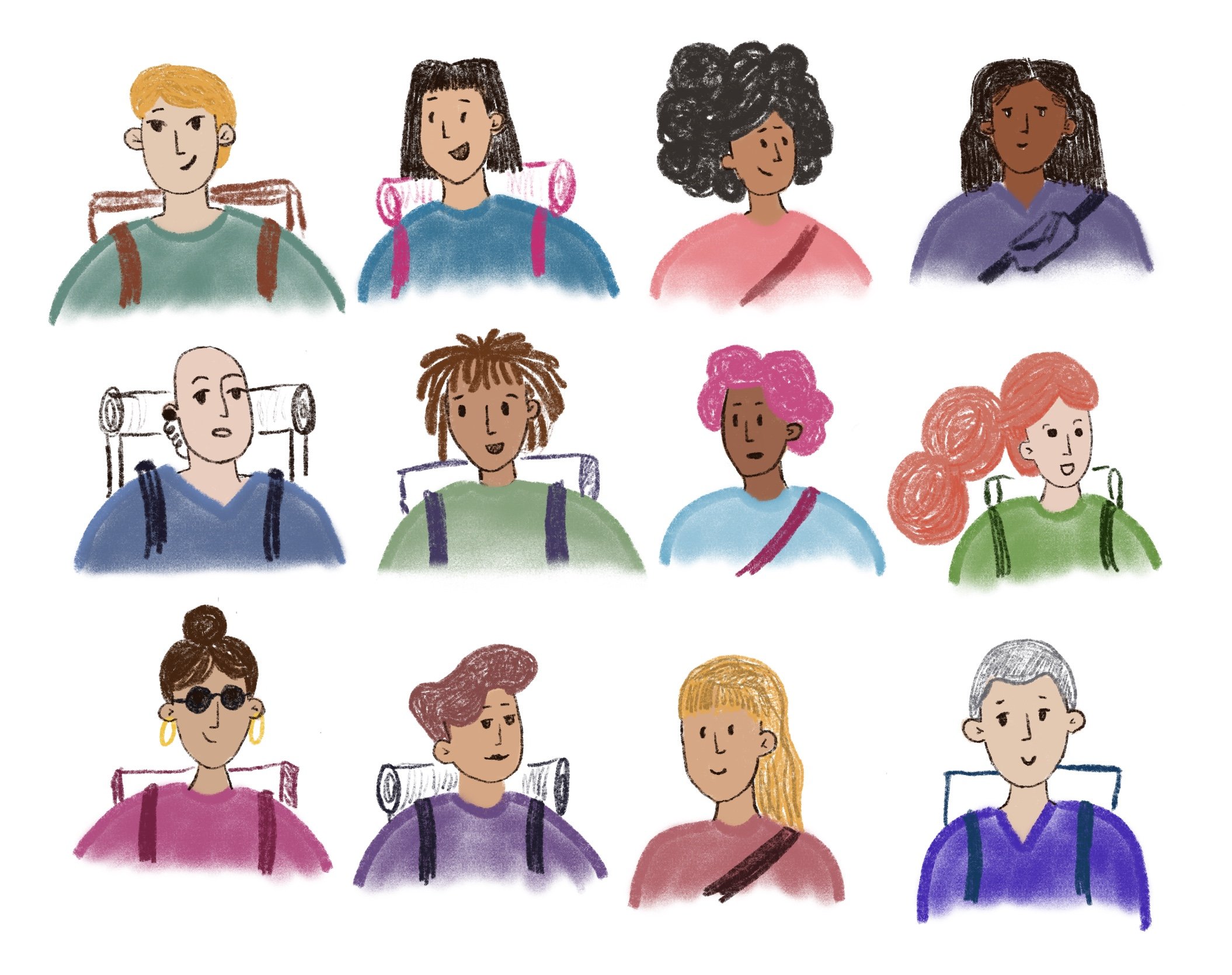
Avatars and Rewards
A diverse range of avatars is available, representing various identities and ethnicities. To reinforce the theme and celebrate students’ accomplishment, students receive thematic articles related to the unit’s environment upon completing different units.
Process
Art Direction
As the design lead, I collaborated with illustrators and animators to bring the visual elements of the program to life. This involved:
- Crafting detailed briefs to guide the creation of animated banners, avatars, and reward items.
- Developing moodboards and initial sketches to visualize the aesthetic direction and ensure alignment with the overall vision.
- Establishing a structured feedback process to continuously refine and improve the visual elements based on iterative reviews.

Design System
Given the importance of theming in the user interface, we developed a comprehensive design system. This system streamlined production and communicated the visual logic to the technical team, ensuring consistency and efficiency throughout the development process.


Accessibility
As the inclusive design lead, I ensured the platform met WCAG 2.2 accessibility standards. This involved:
Visual Accessibility: Ensuring sufficient color contrast and visibility of visual elements.
Developer Annotations: Providing detailed accessibility annotations to the development team to support keyboard-only users and screen reader users, making the platform accessible to all students.
Treasure Hunt, the VWA Game
Building on the positive feedback from the pilot, we developed a mini-game titled Treasure Hunt. This game, integrated into one of the units, leverages existing animations to create an engaging activity where students navigate through various challenges to reach a hidden treasure.
Game Mechanics
Students participate in activities that align with the unit’s theme, using the skills they have learned to progress through the game.
Integration
The game is seamlessly integrated into the learning experience, reinforcing vocabulary concepts in an interactive and enjoyable way.


